VoucherCodes is a leading UK savings destination. Their website has huge traffic, although most of the times the user comes from a google search. One of the main goals for the whole year 2017 was to increase user acquisition and to ensure that at least new customers visit us twice a month. Last year Personalisation was one of the main goals, we need it a plan to start to apply it.
Home in the website had a low performance, data was telling us that content from the top didn’t engage with users and there were low interactions. Content was static and not relevant to the user.
Problem statement
How can we create a much more effective home and help customers to save more?
Team
A team of 12 people ( Business Analysts, UI Enginners, Backend Enginners, QA, Project Manager, Designer)


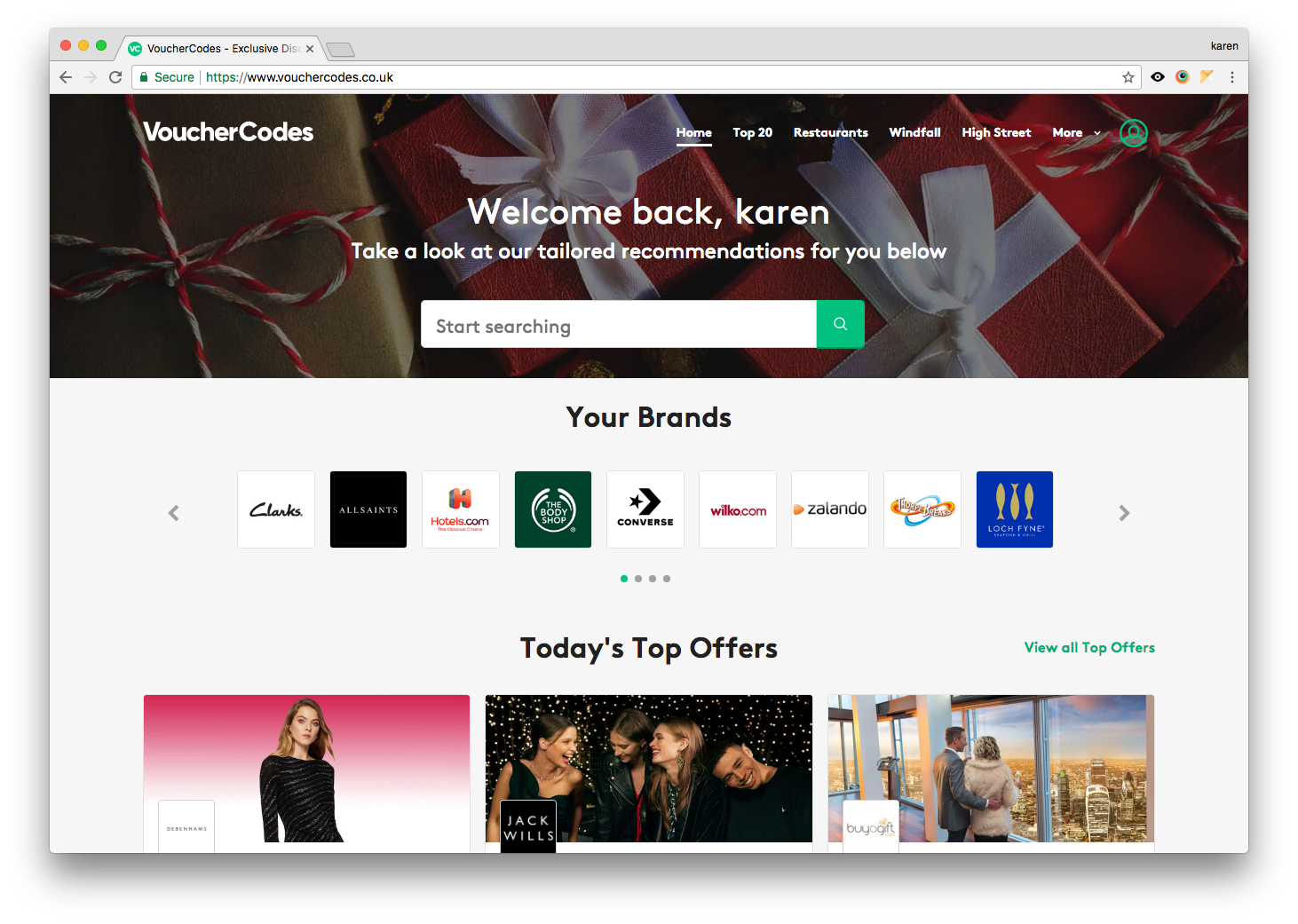
Previous Homepage on the left - New design on the right
Research
User Testing
The current website home work well but customer research revealed that a large group didn’t engage for these reasons:
Content wasn’t relevant
There wasn’t any incentive
Usability problems
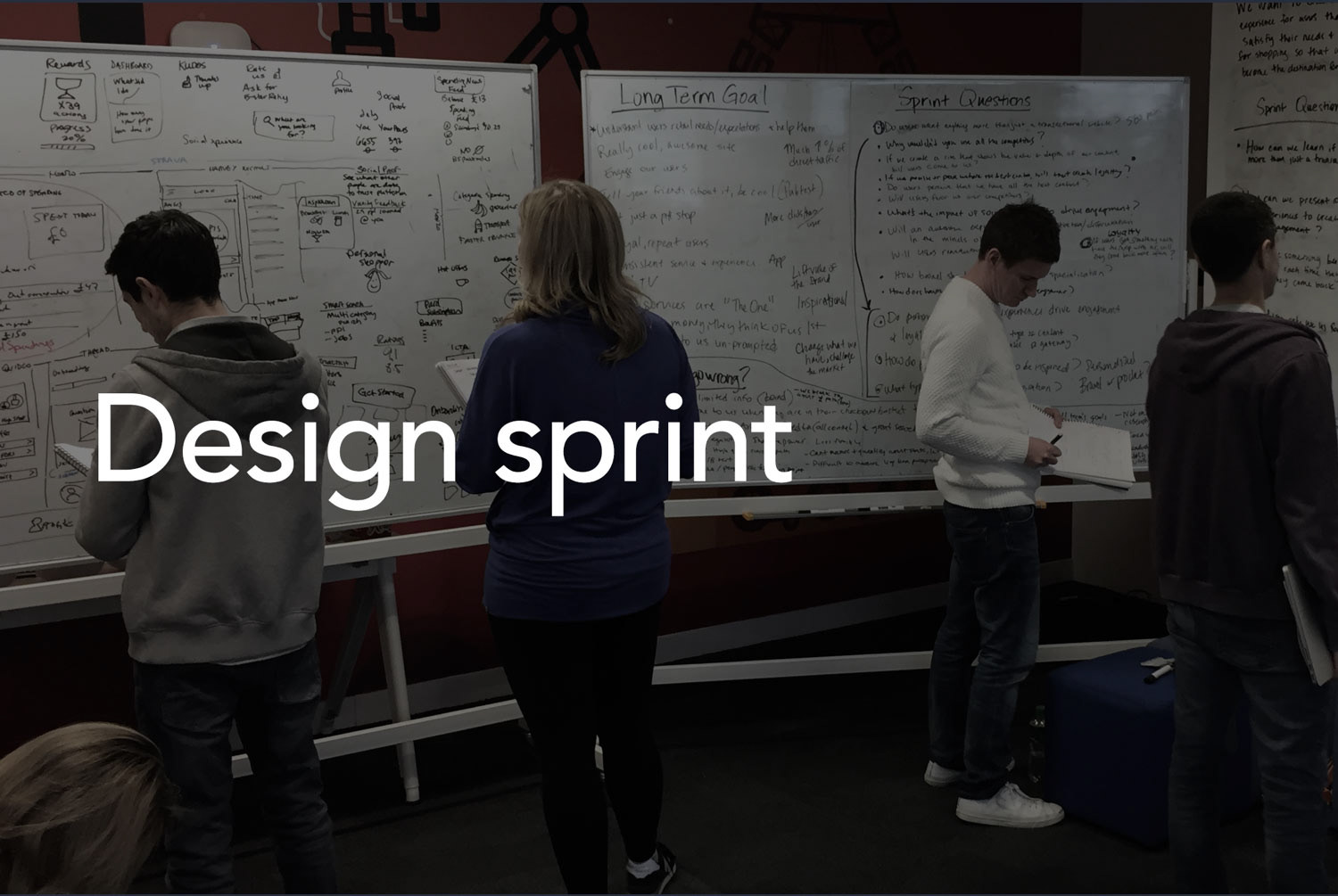
Once we had the evidence of the problem, the UX team felt there was an opportunity to use design Google Sprint to explore particular aspects of the project, work together the team and other stakeholders and end up with a prototype to test after a week.


Design and Testing
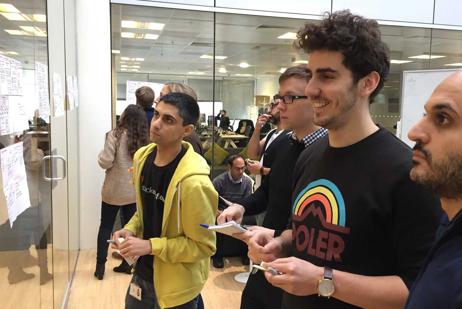
This was the first time we run a Google Sprint and it was very fun and successful. By the end of the week we had an early prototype, so we had a clear understanding of the pieces we needed to iterate. Everyone involved relished the opportunity to participate in the design process and play an active part in defining the future of the customer experience. Collaborating with a team of project managers, engineers, marketers and designers.
Prototypes
We had several prototypes to test, from different areas
Onboarding
Community focus
Loyal Program - Incentive
We had constant iteration of the prototypes, they were prepared using Invision, starting with Mobile and then Desktop. After several rounds of tests, the first experience that was launched was the Onboarding and the Home - Tailored for you.
UI Design
As part of the project the Design team was Re-branding the site, as a challenge was to create new format cards and new styles. Making sure that the usability was improved.
Results
Since the first MVP the new experience has been improving the conversion rates, feedback from customers has been very positive. Currently is on continual iteration.