Purchase experience
Rate & Review
Brief
A key pillar of the MVA12 was the shop area, my team had to work very closely with Spain as they were the first ones to launch it.
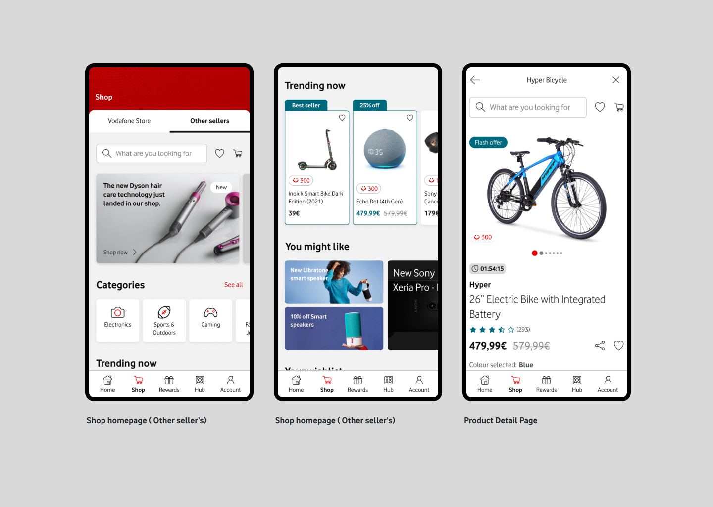
The shop area was going to offer Vodafone Store & Other seller's products ( 3rd Party)
Rate the product and the seller was a key factor
The same product could be sold by Vodafone and by Other sellers
For the customer to know the seller's feedback was determinant for the purchase decision.
Challenge
Key journeys for the shopping experience were tested, among of them, was the Rate & Review ( product & seller) The User testing report mentioned some pain points that needed to be looked at and resolved. Also suggested to explore having both sections in one single page.
Pain points
Prompt with the seller feedback wasn’t expected
The flow had some friction
The stars rating from the Sellers form was missed
Sellers form very long
To consider
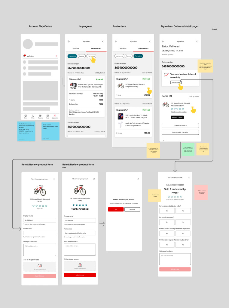
Entry points: My orders, Home (product cards), Email
Interaction pattern
A key pillar of the MVA12 was the shop area, my team had to work very closely with Spain as they were the first ones to launch it.
The shop area was going to offer Vodafone Store & Other seller's products ( 3rd Party)
Rate the product and the seller was a key factor
The same product could be sold by Vodafone and by Other sellers
For the customer to know the seller's feedback was determinant for the purchase decision.
Challenge
Key journeys for the shopping experience were tested, among of them, was the Rate & Review ( product & seller) The User testing report mentioned some pain points that needed to be looked at and resolved. Also suggested to explore having both sections in one single page.
Pain points
Prompt with the seller feedback wasn’t expected
The flow had some friction
The stars rating from the Sellers form was missed
Sellers form very long
To consider
Entry points: My orders, Home (product cards), Email
Interaction pattern
Landscape Analysis
Some exploration was done by looking at some other companies.
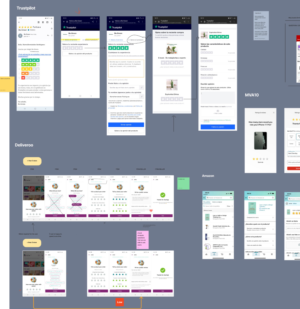
Trustpilot: Using taps, a section for rating products and another for the seller
Deliveroo: Using a stepper, Info about the fold, Short sentences
Amazon: Separated forms, Entry points inside the order
Some exploration was done by looking at some other companies.
Trustpilot: Using taps, a section for rating products and another for the seller
Deliveroo: Using a stepper, Info about the fold, Short sentences
Amazon: Separated forms, Entry points inside the order
Ideation
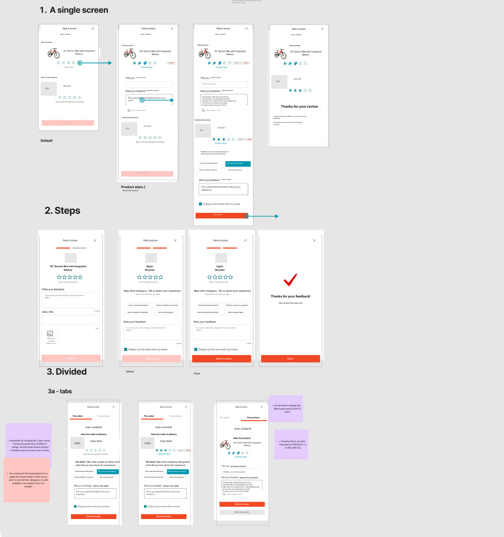
Proposals on how to include both sections Product and Sellers inputs. Interaction patterns
Vertical scroll + Progressive disclosure components
Stepper
Taps
Timeline for asking the user
1 Day - User completed purchase
2 Day - Receives the order
3 Day * (Completed status day) Rate Experience button will display in My orders page. An email will be sent to invite user to fill form, specifically the Seller section.
After 5 days, the user receives the Rate the Product email